
One colour, two characters
The same Red shade with two surfaces – a cloudy, stone-like pattern and a fine, linear grain – creates two completely different moods from one colour.
- facade-board
- surfaces
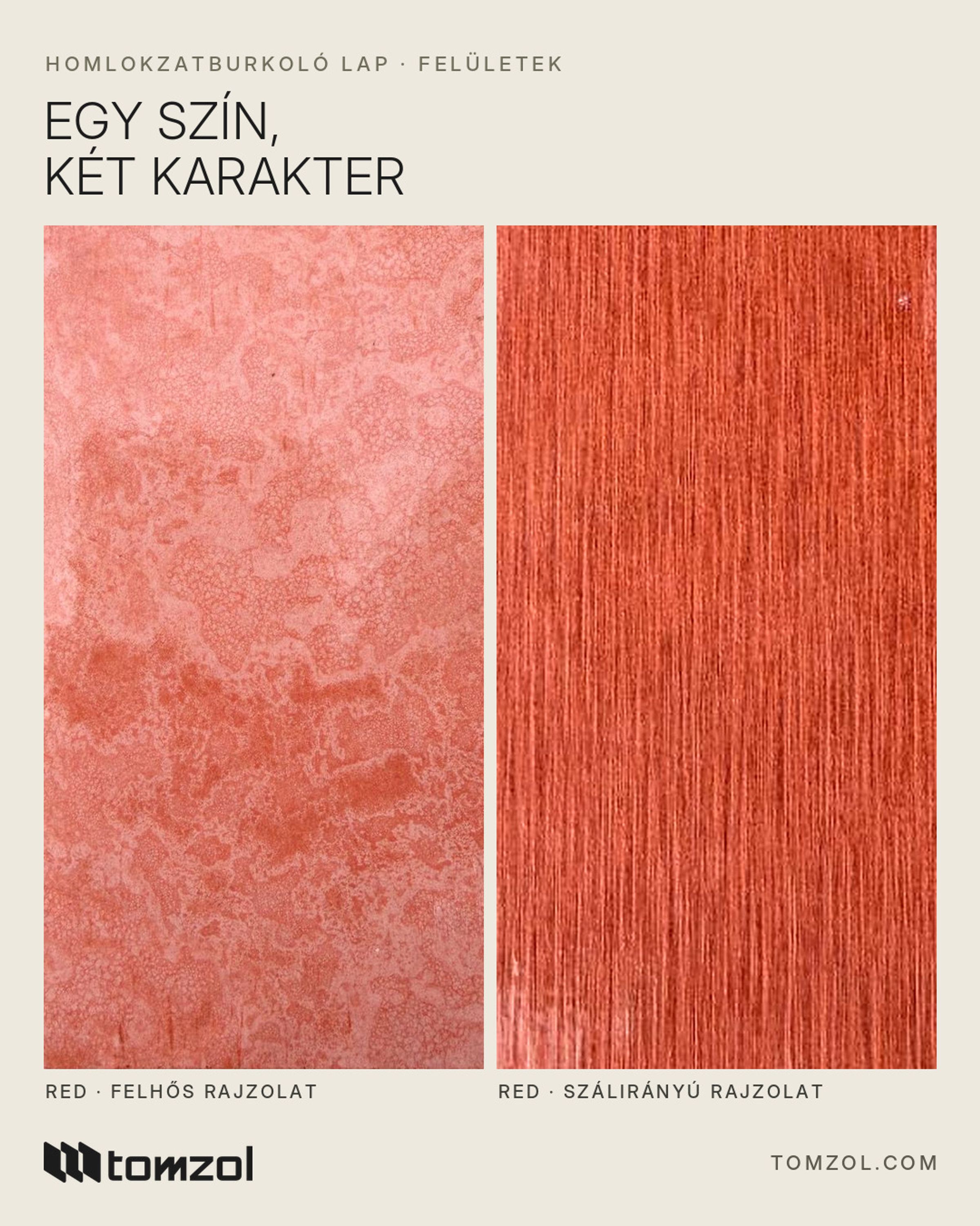
When choosing a facade colour, we tend to focus on the colour alone. Yet the surface shapes the mood of a building at least as much. The photo shows the same Red shade with two different surfaces – and it is immediately clear that one colour can take on two quite different characters. In this article we show how they differ and how to choose between them.
Same colour, two moods
The same Red shade with two different surfaces:
- on the left, a cloudy, stone-like pattern: a lively, natural look
- on the right, a fine, linear grain pattern: a more subdued, even appearance
In the cloudy, stone-like version the colour gathers and thins out in patches, as if you were looking at a slab of natural stone. The facade gets a lively, animated surface where no two boards are exactly alike. With the fine, linear grain pattern the red spreads more evenly and calmly; the surface stays refined up close and looks almost uniform from a distance.
Why does the effect change with the surface?
Our eyes always perceive colour together with light and the pattern of the surface. On a veined, cloudy surface the light reveals many different tones, so the colour looks richer and more natural. On a surface with a more even pattern the light is reflected more uniformly, so the colour appears cleaner and more graphic.
What is more, the Facade Board is through-coloured, so the pattern is not a print on the surface: the colour runs through the entire thickness of the board, and the same colour shows underneath even if it is scratched.
This variety is one of the great advantages of fiber cement. The material was patented around 1900 by the Austrian Ludwig Hatschek, and for a long time it was known mainly as a plain, grey, functional board. Today's through-coloured boards, however, are true design tools: by combining colour and surface, the same material can be bold or restrained, natural or graphic.
Which one, and when?
There is no better or worse surface – the right choice depends on the building and the effect you want:
- The cloudy, stone-like surface is a good choice when the facade should feel lively and natural – for example on a family home, in a garden setting, or where the red should recall the tradition of stone cladding.
- The fine, linear surface is a good choice when you want a clean, unified effect – for example on a modern building with simple massing, an office building, or wherever the red should be strong but calm.
- The two surfaces can even be combined on one building: one provides the base, the other highlights a part of the building, such as the entrance or the stairwell.
- Consider the surroundings too: if neighbouring buildings, the fence or the paving already bring a lot of pattern, the calmer surface creates balance; in a plain, smooth setting, the cloudy pattern brings the facade to life.
- Always compare the two versions on a larger sample and in outdoor light – the difference really shows in daylight.
Surfaces and versions
The Facade Board is made with polished, textured and natural surfaces, and in a ribbed version too – so the same colour can give a building a completely different mood.
- Polished: finely sanded, smooth and even.
- Textured: a slightly structured, matt surface.
- Natural: a stone-like, marbled, cloudy pattern.
- Ribbed: an 8 mm board, at most 10 mm at the ribs – the play of light and shadow adds extra depth.
Apart from the surface, all other properties of the board stay the same: it is class A1 non-combustible, frost-resistant, and made in 2440 × 1220 or 3050 × 1220 mm.
We can send samples of both: write to info@tomzol.com or call us: +36 30 959 6537