
RED – a facade you notice from afar
A warm, brick-like red that does not just sit on the surface: the colour runs through the entire board, so there is no flaking paint and no repainting.
- facade-board
- colours
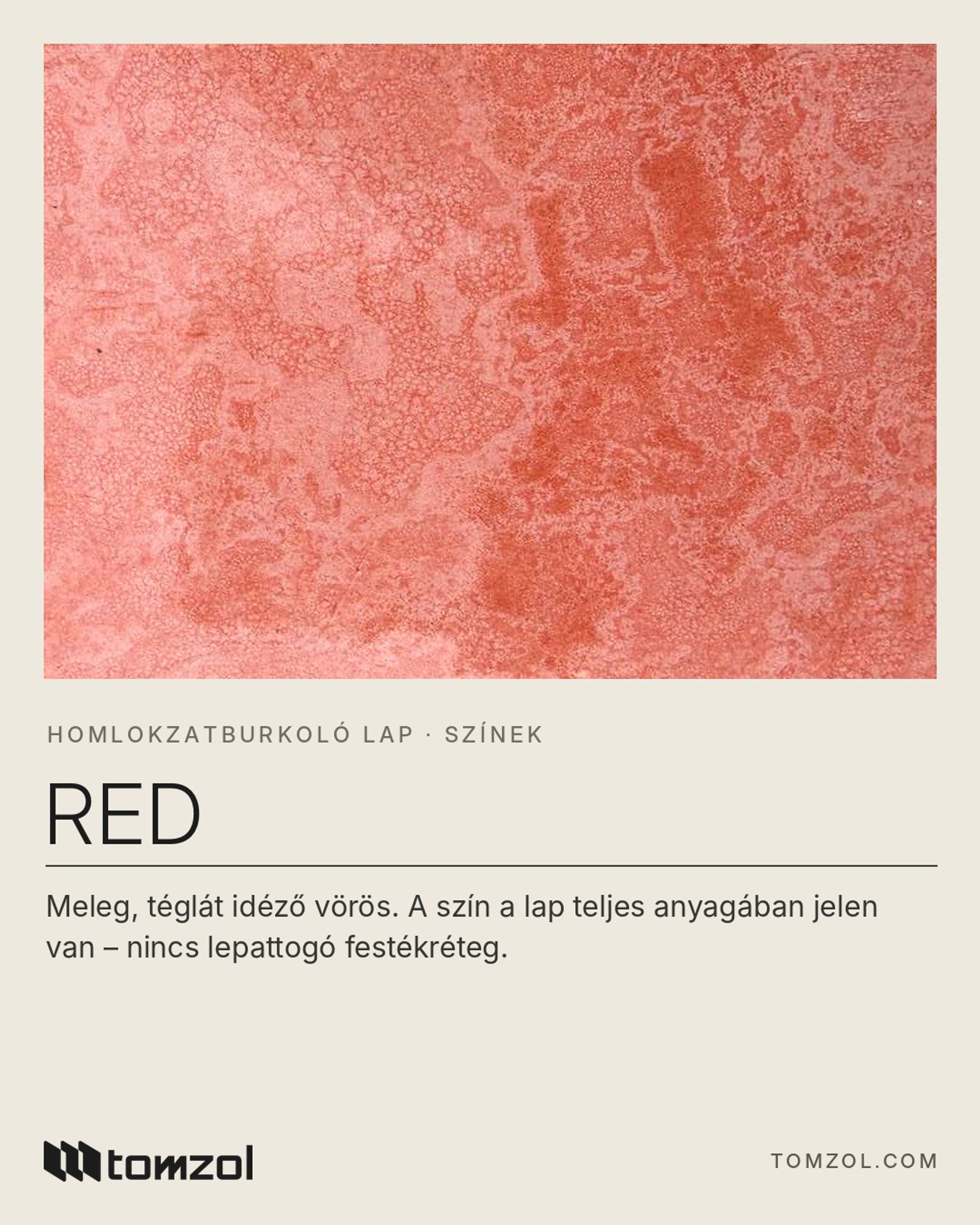
Some colours you walk past; others you notice from afar. Red belongs to the second group: a warm, brick-like red that does not just sit on the surface – the colour runs through the entire board, so there is no flaking paint and no repainting. In this article we show where it works best, what to pair it with, and what to consider if you are thinking about a red facade.
Why red?
Red is one of the oldest facade colours in architecture: brick buildings have carried this warm tone for centuries, so our eyes read it as homely, durable and reliable. Red brings that tradition to a modern, large-format, flat board – the feel of brick, but without a joint grid or brick format, with a clean, contemporary look.
Red is also an excellent landmark: a red entrance or stairwell shows the way from the street, and a red facade is easy to remember – whether on a home, an office building or a shop.
Where does it work best?
Red works well on large, continuous surfaces and on accent areas alike. A few proven applications:
- The whole facade – a strong, characterful look that emphasises the building's mass.
- Entrance – red cladding naturally draws the eye towards the entrance.
- Stairwell – a vertical red band structures the facade and gives rhythm to longer buildings.
- Balconies and loggias – projecting or recessed elements clad in red make the facade more three-dimensional.
Pairings: Ivory and Light Grey
Red is at its strongest next to a calm, neutral partner. Paired with Ivory or Light Grey, it creates a clean, modern contrast.
- Red + Ivory: a warmer, friendlier overall effect – an especially good choice for houses and residential buildings.
- Red + Light Grey: a cooler, more urban character that also looks good on office and commercial buildings.
- Tip: decide in advance which colour plays the lead. If red is only an accent, keep most of the building neutral, so Red becomes a real highlight rather than an intrusive one.
- It is worth choosing the colour of windows, doors, eaves and railings together with the sample – neutral, restrained tones work best next to red.
Colour that does not wear off
With a vivid colour it is especially disturbing if the surface becomes patchy over time, or a different colour appears under a scratch. With Red, the pigment is mixed into the cement mass at the very start of production, so the colour is the same throughout the board's thickness. If the surface is scratched or an edge is chipped, red still shows underneath, and there is no paint layer that could flake off.
When choosing the colour, the same rules apply as for any facade: look at the sample outdoors in daylight, in the morning and in the afternoon, and allow for the fact that on a whole facade the colour usually looks lighter and more vivid than on a palm-sized sample. For one building, order the boards in one go, from one production batch where possible. The photo shows the actual colour sample, photographed in natural light.
The board in brief
- Through-coloured, high-density fiber cement board, in 10 colours
- Board sizes: 2440 × 1220 and 3050 × 1220 mm; thickness: 8, 9, 10, 12 and 15 mm
- Fire safety: class A1, non-combustible (EN 13501-1)
- Frost-resistant, 100% asbestos-free
- Suitable for ventilated facade systems on low-rise and high-rise buildings, in renovation, and on balconies, loggias and soffits
Questions about the colours? Write to us at info@tomzol.com or call: +36 30 959 6537